Fun with Flat Lays
20th May 2022
Last spring, we had a photography session at the shop with Heather Hall. She has shot the shop a few times over the years and has become a dear friend in the process, and I am telling you: her work is majorly stunning. I should really figure out how to get a gallery tab on my website so that I can just feature the outcomes of these sessions because she captures in images precisely the kind of mood and atmosphere I hope to evoke with the shop. So when I posted Heather's photos last spring next to my own daily photography of the shop, which I took using my iPhone, I saw rather forcefully that there was a visual chasm between the two. It was evident and embarrassing. On the left, you had visual poetry. On the right, mediocre prose.
And the worst of it was that I actually really love photography! And I own a great camera! But I wasn't very experienced at manual photography, and somehow the ease of using an iPhone to snap and post pictures in a matter of seconds became so habitual, I didn't ever think about trying to do a better job capturing the shop on my own. But the stark contrast I saw between professional photography and whatever I was doing struck me with two epiphanies simultaneously: 1) I needed to invite Heather back much more frequently than I had been. Great photography tells a story that your average photography simply can't. And 2) I needed to up my own game so that the daily images I took between photo shoots could more seamlessly coexist with the images Heather was capturing.
So I began, last summer, trying a new approach. Instead of taking a quick photo of what I needed at the time I needed it, I started dedicating one day a week to doing shop photography, usually setting up a couple of flat lays and giving myself ample time with them. Time to tinker. Time to play with settings. What happens if you kick the aperture way down? Now up? If you adjust the ISO on a shot and compensate accordingly elsewhere, how does that change the light? I'm never been a great learner from manuals. The best method for me is to just experiment and pay attention. And I think, looking over the past year, I've made some progress!
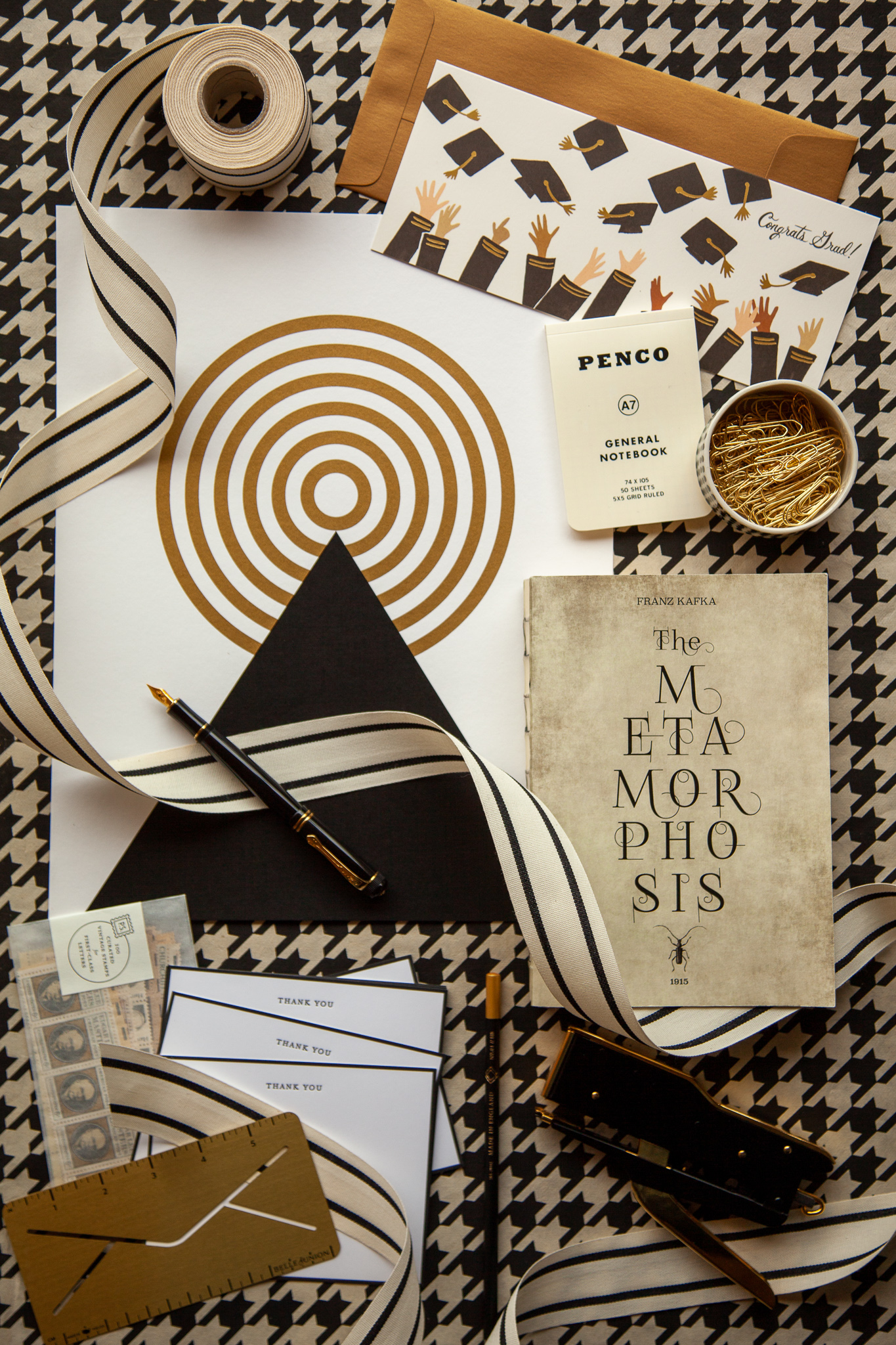
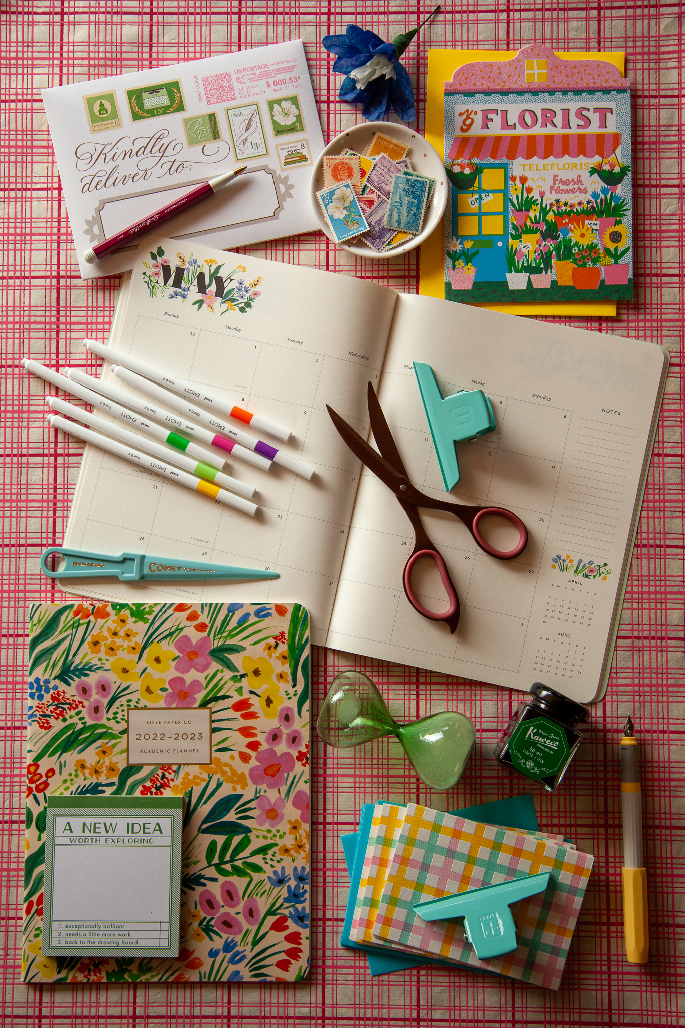
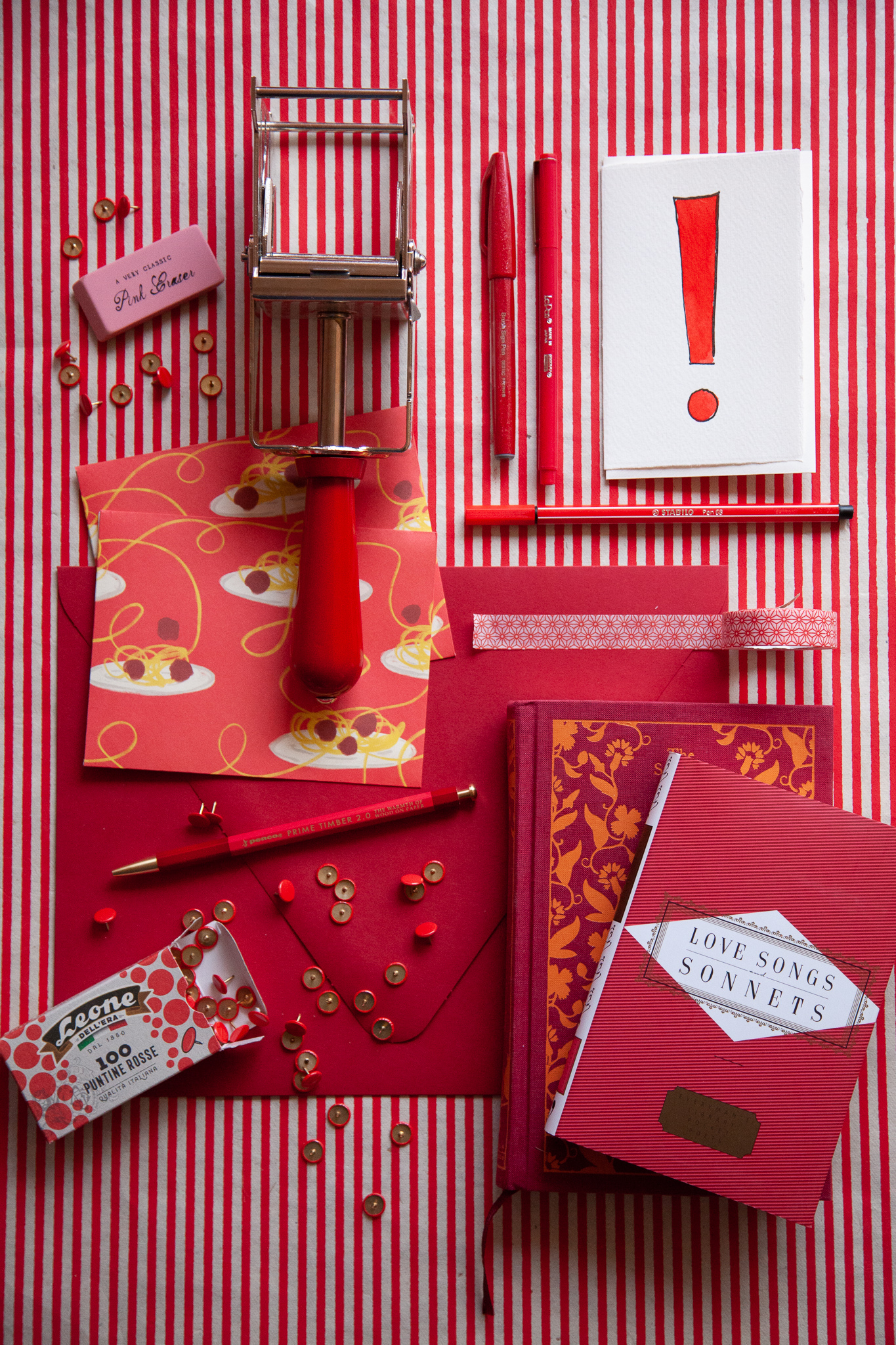
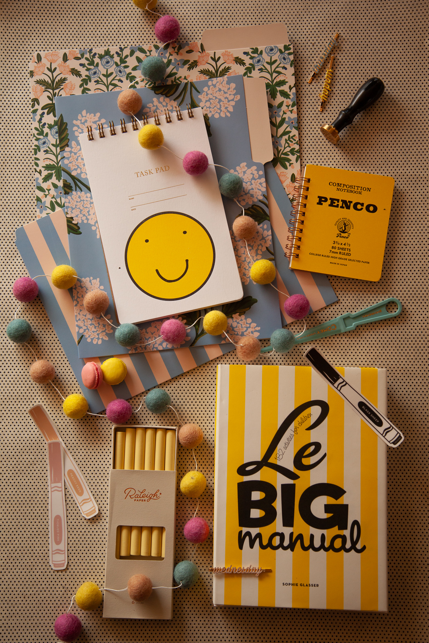
But surprise! This post isn't actually about manual photography — it's about something I've learned as a byproduct of trying to improve my skillset. Flat lays! Styling them is its own creative process. As with so many things, if done well, they should look effortless, like all of the objects were of course destined to be nestled into this scene just so, while in reality, they can take some time and effort to get right. I don't necessarily have a formula I use (and with anything creative, formulas can get in the way of spontaneous choices that might be just what you need to make something sing), but I do feel that when I look at some favorite flat lays over the past year, some parallels pop out to me:
- Anchors: Given that I carry so many books and journals and envelopes, I find myself using sizable rectangles as anchors. Typically at least one or more of these are at obvious right angles to the frame. They often create a strong initial focal point and do what anchors do — provide stasis and stability.
- A dominant moving line: A flat lay made up of only rectangles could be done very well, I'm certain, by someone else, but if I leave it at that, the image can feel too static and blah. To help the eye travel and to create energy and dynamism, I like to use ribbon or twine or garland or some kind of strong, snaking and swirling line. It's a struggle to figure out what to use other than ribbon because it is so perfect for this.
- Small movement: In the absence of—or in addition to—an organic, curvy line, I like to add other small objects at angles to also keep the eye traveling and, again, to offset the rigidity of the rectangular frame. In my world, pens and pencils and letter openers and scissors and envelopes and handwriting and paper clips are great for this.
- Storytelling through color and pattern: Part of what makes styling a flat lay so fun for me is just pulling items from the floor that share a visual harmony. I like for there to be echoes both thematically and visually. For instance, in the graduation image you have the echoes of the stripes in the print with the stripes on the ribbon and the thematic echo of graduation being a time of metamorphosis and arriving at a summit. And in the springy shot above, you have the echoes of the plaid notecards upon the plaid background with the echo of florals on the card and stamps and planner and paper flower prop.
- Organic presence or an unexpected object: This last element is hard to define, and I don't always
achieve this, but adding a little "something else" can create a lot of liveliness and depth. A candle burning. A freshly made latte. Pencil shavings. Real flowers. Paper flowers. Vintage items like stamps or postcards. They can all provide dimension and infuse the image with a sense of human presence. I vividly remember at a shoot we did with Heather last fall, where we had this cute collegiate scene set up meant to evoke a morning on campus reading. It had books and a notepad and a pencil and it also had a freshly made latte AND pencil shavings AND a burning candle AND an old grandpa cardigan AND crumpled up paper, and we still felt like it was missing something. Heather suggested leaves that had fallen, and Liz and I locked eyes and knew that was exactly it. We went outside, scooped some up, and sprinkled them throughout the photo, and it was the perfect magical touch. They are small and subtle, but again, they add a depth to the image — of time and nature and texture. I think this is a compelling area for growth for me. It takes creative thinking that kind of transcends the logical building blocks I begin with.
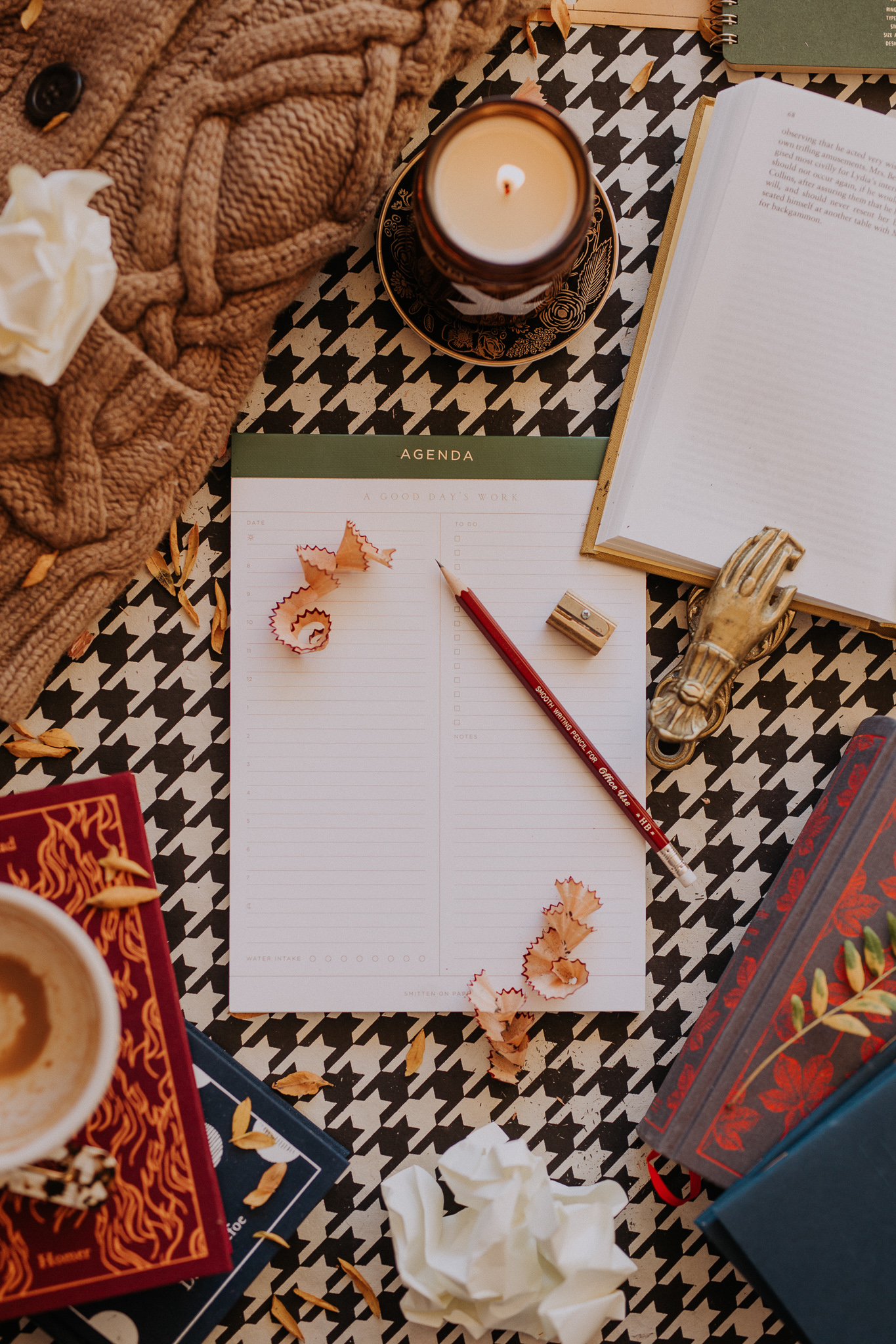
This collegiate scene was shot by Heather! The remaining photographs below are my own flat lays from this past year.
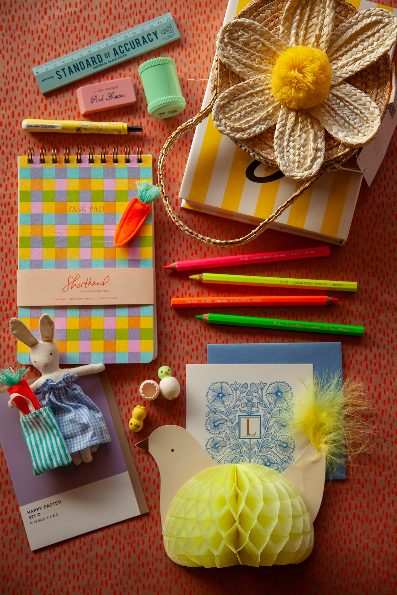
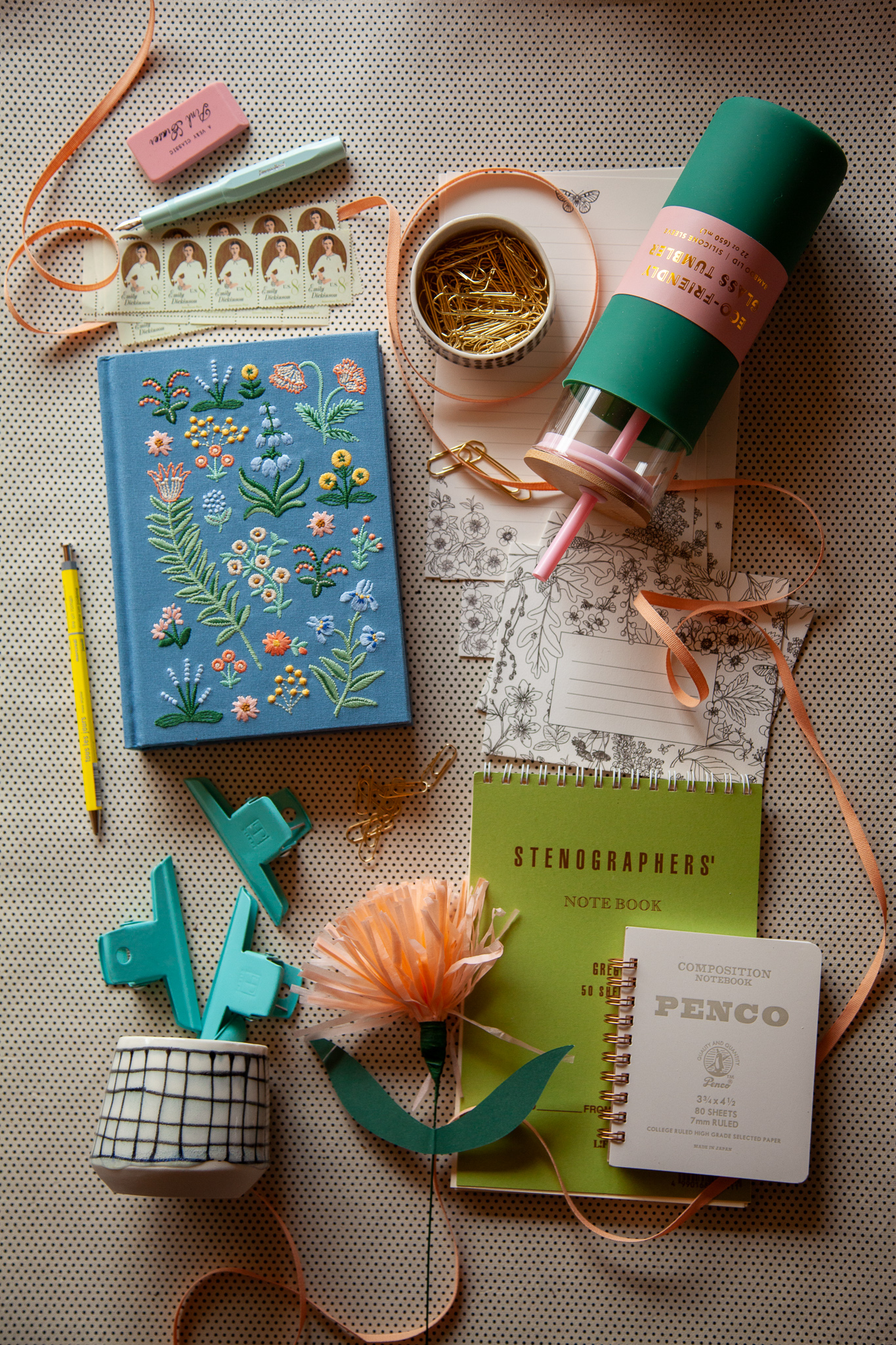
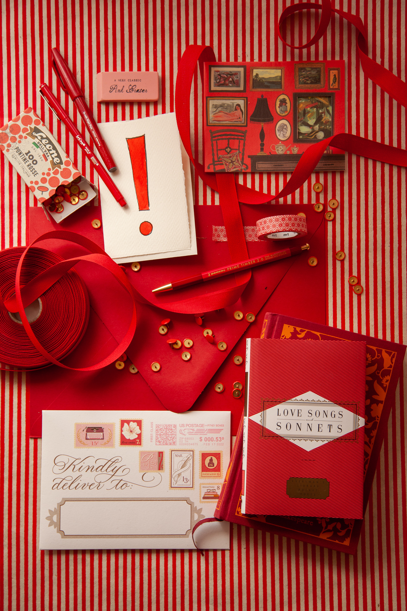
And here’s a great example of an evolution and the reminder that often these set ups take time and patience. The below image is where I started with the flat lay that turned into the above image. Some of the difference between the two is obviously the warmer and richer light above — which was a magic I don’t fully understand — but you can see that a lot of what makes the final version sing is just the particular collection of objects and their movement as well. I try not to force it and to just walk away and come back in the morning if I need to. That made all the difference here.
I still have an immense amount to learn about manual photography, especially about light and shadow, and about photo editing as well, but I have truly appreciated this creative challenge and feel that the shop Instagram feed has improved pretty radically over the past year. And even better—Heather returns on June 5th, so we'll certainly have some new magical photos to share soon! But here's hoping there won't be quite as striking a difference between hers and mine as there used to be.
